Powered By Blogger

Wednesday, 8 December 2010

NEW

project, new direction! I hate using colour, I'm creating something dark and eerie.
Here's some works in progress so far!


.


Nothing's finished, and these probably wont even be put in the project, but I'm feeling really inspired already.
I've decided on a death by fashion theme, looking at all things dark and also quite gothic (which is easy for me as I spent about 5 years of my life being a "goth") I have an amazing photo shoot planned.
And I'll be taking influence from all of my favourite dark collections and street styles as well as looking at the lovely- although perhaps cliche Tim Burton. (Hence the bad ink illustration at the top that was supposed to be Lydia Deetz from Beetlejuice.)
I've decided in this project to stick to my usual style, I experimented for the previous project but I don't think my illustrations were as strong as they usually are. ALSO the whole project will have to be dark, which means I don't have to use stupid colour!
YEY
anyway.


Saturday, 27 November 2010

19

Started to work in a less messy style. ink bleeding everywhere and ends of paint brushes are fine but I realised half of my project is like that and I miss neat lines :(
So I'm doing a couple of illustrations like this to throw in there, this literally took ten minutes. I drew the shape of the body in pencil then inked the face (I find if I just straight out do faces in pen or ink they work out better than redoing it constantly in pencil)
This piece isn't finished. Still needs rubbing out in areas and I might put some colour in the background.

Food colouring and black ink.


Friday, 26 November 2010

18

Today has been eventful... the book arrived! and we set up the exhibition at the gallery space.
Here are some pictures of some of today's events...
our exhibition space, we even painted the table.
two of my pieces together in the book.

 The front cover by Ellie :) because of the vast amount of colours and the vibrance of the front cover we decided to make our exhibition space very muted and dark so it stood out.


Introduction

Another one of my pieces cropped to fit in the book. The colours actually printed really well.


I've also been working more on my illustrations, I finally found a yellow food colouring... although I had to trek all the way back to Coventry to actually find one (it wasn't obviously the soul purpose of my trip). And after spilling half the bottle of this sacred medium all over myself (I look like I have jaundice) and my desk I managed to get some drawings done.
Here's one of the pages. The yellow dominates the image.
as per usual the illustration is free hand ink and food colouring. The blue and  green were used to colour the page before I drew on top. 

 Today I also brought a nibbed pen, so I could use ink but not have to use the wrong end of a paint brush anymore- it was quite restrictive in terms of weight of lines etc.. I haven't really done anything that detailed so far. So I spent my Friday night on this: an interpretation of a miu miu dress. (Sorry if none of this is coherent I'm pretty tired now) It's free hand ink, (not drawn with pencil beforehand if no one understands what freehand means). It's basically just me trying to get to grips with using these dodgy quill like nibs. It might look pretty good after it's been messed about with and fixed in photoshop... if I ever get it back...
 Deadline in four days!!!!!!


                                                                 N.

Thursday, 18 November 2010

17

This week I've been concentrating of visual research and getting my essay done.
I still hadn't decided on what I wanted my essay to be about- to write an epically good essay on one piece of art/advertising is very difficult unless you are passionate and genuinely interested in the featured piece.
For Inspiration I spent Tuesday visiting four exhibitions currently showing around London.

The First one was JP Thurlow's 100 Covers..
fortunately showing just round the corner from me in Hoxton Square.
This was the exhibition I wanted to see the most, having seen it advertised everywhere and with every magazine I love promoting it endlessly on my home page on Facebook.
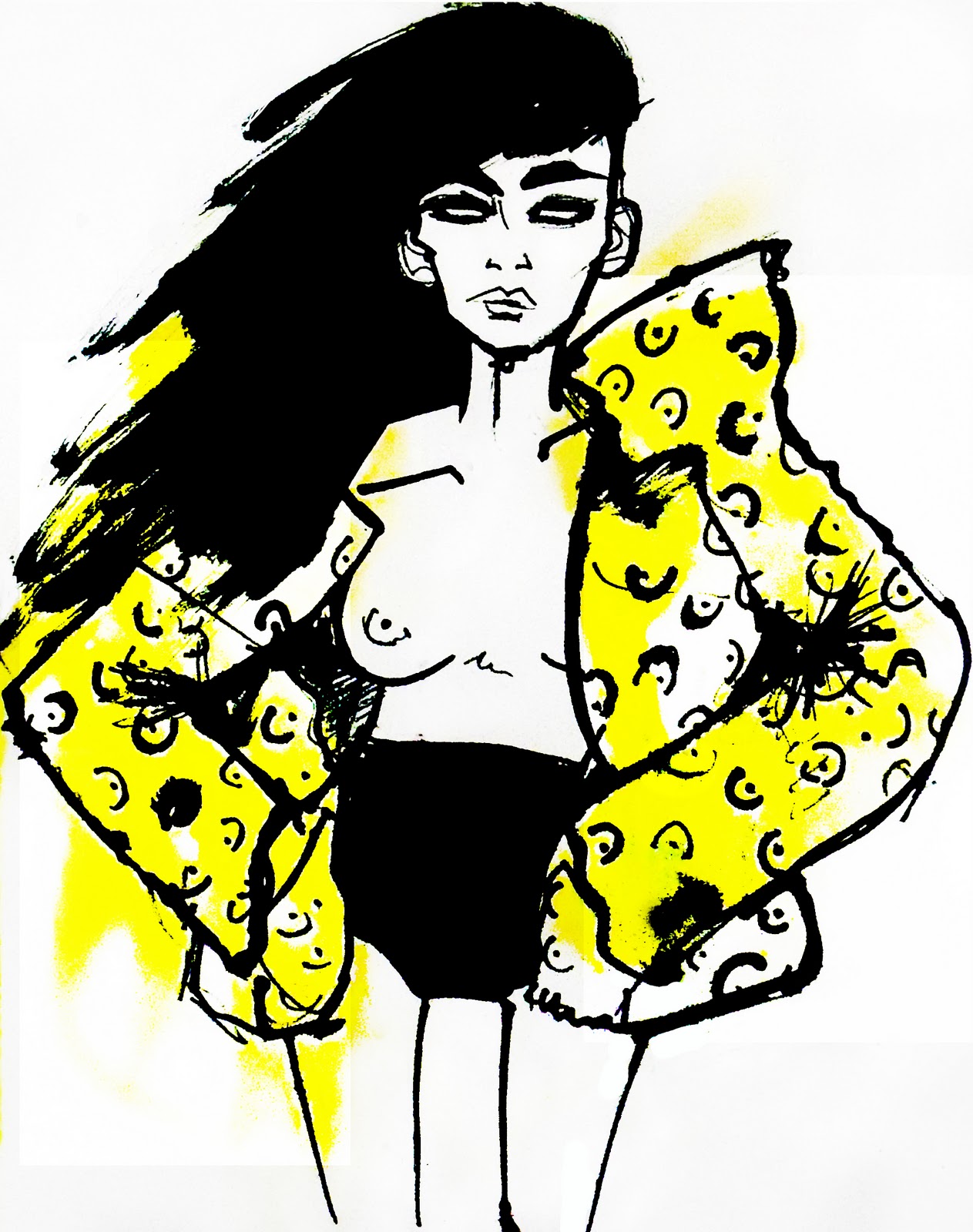
It's the sort of art that I love; something that shows a tremendous amount of skill. The few covers I had seen online looked incredible, and even better and more detailed in person.
I devoured each picture, recognising quite a lot of the front covers made me realise I have an obscene magazine collection at home. Thurlow had managed to reproduce each cover in such a way that I left awed if not incredibly envious of their talent.
The exhibition is free, and still open at the KK Outlet. I would definitely recommend it, especially to anyone doing Illustration as the incredible amount of motivation and inspiration I left with actually made me go home that night and draw my ass off.

Second was a trip to the Barbican to see another exhibition that had been highly publicised. "30 years of Japanese Fashion" offered me an insight into a field of fashion design I knew little about. The most I could have offered you before hand were the words "harajuku" and designer " Issey Miyake". 
There was a fascinating array of Japanese fashion, letting me truely indulge in Japanese style.
As a fashion illustration student I do think it's is ridiculously  important to have a full and varied knowledge of all areas of fashion, to have a vast mass of information on hundreds of designers and trends and styles.
As an illustrator in this field ignorance will only let you down, at the end of the day it's subject  of  your illustrations, it's what separates this course from your average Illustration course.
The exhibition at the Barbican added to my knowledge and inspired me to add researching the fruits of this particular continent to my to-do list. I loved the geometry in the designs- shape and form being something I particularly try to apply to my own illustrations.
Definitely worth the £8.00.
Then we went to the Design Museum to see Drawing Fashion.
the exhibition was an almost chronological archive of Fashion Illustration dating from as early as 1910 and including the work of illustrators I had previously researched for the project such as Erte and Francis Berthoud. The latter someone whom I had not been too keen on previously but after seeing his work in person I am much more appreciative of the skill and technique (above is a mural painted outside of the museum of one of his illustrations).
It was fascinating to see how fashion illustration had evolved, walking through the exhibition really was walking through time. I adored the vintage Vogues and nearly hyperventilated when I noticed some of Lepape's original illustrations.
I wish I could create something so beautiful.


Lastly, Somerset house for the Dior Illustrated  exhibition. By this point my feet were about ready to drop off, and if I hadn't desperately wanted to see this I probably would have thrown the towel in and gone home.
The exhibition was AMAZING. I left having fallen in love with Gruau, you really have to see these pieces right in front of you to fully appreciative how amazing they are.
To think that they were all hand painted using the most difficult medium on earth (well for me) gouache paints created a whole new level of respect.
Gruau really did capture the essence of Dior, or perhaps his illustrations and advertisements for the fashion house helped create their elegant and modern reputation?
Either way Gruau is iconic. And if you love Dior or all things couture, being able to gaze upon actual  haute couture (including pieces by Galliano) albeit behind two screens and a few metres away will basically complete your life.


I think this is the most I have ever written and I'm losing all enthusiasm for this entry!
In conclusion this week has been eye opening!
I learnt more in that day then I did all term, I realised all of a sudden that I am actually doing a degree. Information isn't going to be handed to me on a plate any more, I'm not at school. I should be more productive and do things like this more often, instead of moaning.


anyway, I'll probably edit this later as it's probably terrible.


N.


P.S we finished the book!

Thursday, 11 November 2010

14


Editing some final illustrations to try and make them more polished. First all nighter I've pulled since I started this course.

N.

13

This is some more ink work from Wednesday. Possibly final Illustrations, but I can't seem to do anything I actually like.

Based on my final photographic image of Stevie, free hand ink on food colouring.
This is an experiment on masking tape. Free hand ink on tape and paper. The ink bled underneath the strips of masking tape making it messy and unpredictable. But I kind of like the outcome.
It's a little bit scary.

Cracking on with my visual research and essay tomorrow. It's been completely neglected. Oops


N.

Wednesday, 10 November 2010

12

Photoshopping Harry's images. I wasn't present for the Carnaby Street shoot as I'd agreed to model for a friend- a MUA at LCF.
However Harry was kind enough to give me some images to mess around with.

I had contacted Merc previously regarding the project and they had sent me press releases and archived advertisements for the brand, Harry also contacted them (great minds think alike) and they were kind enough to loan us their clothing for the location shoot.

Baring both of these things in mind I decided to recreate an advert that they had sent me that was vintage from the 1960's. Not necessarily the same but I aimed to edit the image in a style that would make it plausible for it to have been taken at the time.

The image was taken in a dark area, using the flash as key light so I had to correct the lighting, exposure etc before attempting anything else, It began as :


and ended as

(photography credits: Harry Cunnew)
stray hairs = ARGGGH I pity any professional retoucher out there.
I love this shoot. I think a good job was done on styling, MU and it was well thought out in terms of our project.


We met today to try and arrange the actual creation of the book and our own personal deadline for this as a group is next Friday. EEK got so much to do.


N.

Tuesday, 9 November 2010

11

Messing around with layering again, this time only using images I have taken myself...


+


=


10

We had a group photoshoot last week. Myself and Stevie volunteered to model so we didn't get much of an opportunity to take any photos. 
I got about twenty in all as Stevie was nice enough to let me get a few- thanks to Alex lending me her camera too. (An SLR is on the Christmas wish list)
Above is one of the edited pictures.
The theme was 60's and some of the shots I think we managed to fulfil this solely due to styling.
Some of us had a clear understanding of what 60's attire was like and managed to dig up some mini dresses.

Friday, 29 October 2010

8

More layering, it's what I do when I can't be arsed to do anything else. That said, these are quite amateur. Created using sourced photographs of Carnaby Street and related topics.


I have a photoshoot tomorrow, but aim to get another illustration done by tomorrow evening.

N.

Thursday, 28 October 2010

7

More free hand drawings using sticks and ink. The colour was applied first and then I drew over the top with the wrong end of a paint brush again :P

Was flicking through October's issue of Vogue Italia as I was doing this and ended up using some of the images as a starting point.
The illustrations were A3 and my camera isn't the best, so apologies for the bad quality.
I need to learn how to do fingers!! They scare me to death.

Anyway, I've recently learnt the importance of a blog- I lost all of my work due to an accident involving a hot chocolate and Gossip Girl (R.I.P the only laptop I ever loved)  and if it hadn't have been for this blog I would have had to do EVERYTHING again.

So thankyou blog, I finally understand.

                                                                         N.

Wednesday, 27 October 2010

6


These are the only OK-ish results from today's life drawing class.
We had two live models, who constantly circulated the room (making it very hard to capture the full picture).
Deciding to attempt something new I used only ink, and the wrong end of my paint brush (so it was like using a stick) to quickly draw the outlines of the female model. 
I worked on A3 too in an attempt to make my drawings bigger.
They're not incredibly realistic but I tried to capture the model as a fashion illustrator, taking care to capture the movement and pattern of the clothes.
My teacher didn't seem too impressed by my attempts, but the class has given me more confidence in drawing with ink and I'm going to try to do images for the project using just this.
  I think I confine myself by having to draw everything in pencil first, working like this just straight out in ink made it harder at first - a mistake can't be changed- but as I became more confident with my strokes I found that it became so much easier AND quicker as there was no room for errors.

N. 

Tuesday, 26 October 2010

5

More CS5 experimentation, messing around with layering old images of Carnaby Street together, really basic stuff and this version is very rough but it creates a lot of depth.
I'll be doing something like this with the images from the group photo shoot.


N.

4

Currently watching FOTC and attempting quick style drawing exercises.
This is from yesterday. I spent approximately 5 seconds going crazy with watercolours drawing random shapes and strokes and then drew quickly on top, spending no more than a few minutes on each sketch.
I'm trying to loosen up my style, I feel like I'm too restricted and my work is dark. Hopefully the watercolours have brightened up this piece a little.


N.

Saturday, 23 October 2010

3

Today was a fail. For the first half, my scanner wouldn't work so I couldn't get any of my drawings onto my laptop.
Then I completely forgot everything I did the first time I messed around on CS5 and had to relearn everything- which was frustratingly slow.
It ended with me hating the end result, making me feel like I wasted the day!

My final illustrations for this project are going to mix past Carnaby Street with new Carnaby Street. At the minute I'm doing this by drawing old things- old styles, trends- seems to be mainly hair and make up at the minute with photographs from today that I have taken myself.

Attempt number two :

 (she looks psychotic)


I don't know which one to use because they're both awful, I'm trying to make a series out of the images. I need to find something a bit more original to draw for the next image.
I've also decided I need to start drawing from a reference, and not just the inside of  my head so that the faces are more realistic and don't all look the same!

N


p.s just attempted to correct the proportions of the face on photoshop ( I know this is cheating but next time I draw I will use a reference so it's initially more accurate)
Better?

Friday, 22 October 2010

2

More work but pretty abysmal. I don't have the patience to really invest much time in my work, I'm trying a freer less detailed approach because of this. This is a 20 mins illustration- I quickly got bored of because its terrible- of 60's fashion.
Watercolour, sharpie and ink.

This is my "drawing like a child" technique.

N